Create Merch
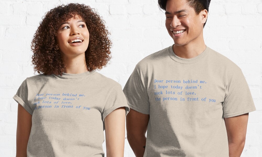
We caught up with Print Bar alumni Lachlan Richards to discover how to create merch that doesn’t suck. Not only does he have plenty of experience working behind the printing press, but he’s also co-founded with his partner Alex Kimpton the design and branding practice, AKLR. Now that he spends his time creating the designs that we occasionally get to put on merch, we thought it was time to pick his brain on what works and what doesn’t from a brand and design perspective.
A lot of the advice he provided was focused on brands who want to bring their logo and imagery to life. Unfortunately, this is something a lot of brands get wrong.
When you create merch, it’s an investment. You want it to represent what you’re about and you want your people to love wearing it. Nobody wants to wear boring or corporate merch. And more importantly, nobody notices boring merch, so if you’re investing – you should invest to stand out!
Lesson #1 Pick Your Poison
Ok well, not poison, or even a drink. But, pick out what merchandise you want to use, and if you’re having some trouble deciding – ask yourself these questions:
- Is my merch going to be a uniform?
- Is my merch going to be sold?
- Is this just for a one-off event?
- How does a T-shirt/Tote/Stubbie Holder/Hat fit in with my brand?
- Does this idea go with my brand’s tone of voice?
Answering these questions will lead you in the right direction. If you’re set on getting t-shirts for your team, and you want them to reach for them whenever they’re heading to work, then you’re probably going to want to invest in a quality heavier cotton blend with a digital print. This will ensure that your merch will look fantastic for years to come.
It’s important to be practical and question why you’re choosing what you’re choosing. Never forget, at the Print Bar, we’re always happy to help out with any questions you may have and we have plenty of recommendations to give.
Lesson #2 Your Brand Rules
You know your brand rules, we know your brand rules, but do you know your brand’s rules? This is where Lachlan put out a strong recommendation to consult your designer, they’re going to know what colours align with your brand and what ones to steer clear of.
Your brand may feature a lovely blue, but the available t-shirt colour options may not match the particular Pantone blue your designer has specified. This is where you could use the digital or screenprint options at The Print Bar to print your exact brand colour onto another coloured shirt.
Consider getting the blue incorporated on a design for the t-shirts that are on a neutral colour like black or white. This can make the colour impact greater and also work with what your people will be doing. Black is a versatile colour if your people are lifting heavy boxes or potentially doing sweaty work.
Lesson #3 Lo-Go or Lo-No
You’ve got a great logo, but have a think before you pop it on your merch. Sounds like bad advice right?
Surely if you’re getting merch to establish a brand identity you should want your logo everywhere? Lachlan says that this is a great way to get your brand out there, but it’s not necessarily the best way. Your brand is always more than just your logo, so build out those aspects where you can. Merch is a fantastic tool to achieve this.
Think about your brand and what it represents. Would an illustration featuring your brand’s colouring do the job? If you’re looking to order t-shirts that will be worn in your bar or cafe, your customers already know where they are – why not feature a slogan or an eye-catching design?
This can achieve brand recognition without the logo and you can create some really interesting designs that your team will love to wear.
If you are set on using your logo, think about how you want it positioned to get the visibility it needs. If it’s a text logo, you may want it in a larger font, or if it’s a design, perhaps you’d like a smaller more subtle placement.
Lesson #4 Be Different
There are a lot of trends in merch design, from the classic logo in the top left corner of a t-shirt to a tote with a logo along the mid or bottom of the bag. These are trends for a reason, they’re effective and get your brand message across fairly easily. But are they going to be turning heads?
Use your merch to get creative and show the voice of your brand through illustrations or bold use of your branding elements. Think of different ways to present your logo and consider how this will work with the mode of merch that you’re using.
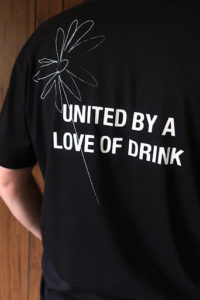
Below is a design Lachlan and Alex put together for the Half Moon Wine Store. We love how the front and back of the shirt was used, with the back piece taking up a larger space so that the text is easily read and featuring some of their brand illustrations. On the front of the shirt, the logo has been popped in the top left corner however, they’ve opted for an iteration that has more spacing and worked better for the design.


Lesson #5 Have Fun
Merch doesn’t have to be an intense process. What’s great about ordering with The Print Bar, is that you can mock up your merch designs on our tools to get an idea of what they’ll look like when printed.
If you’re not looking forward to unwrapping your box of fresh merch when you arrive, then you’re not doing it right! Put something on something that you’d be proud to wear or show off.


